Dark grey looks good, but I think it's too dark. But I like this cool shade.
I tried this brown patterned paper and I like it, but I have gotten various comments that it's too dark or the color is weird or that the color doesn't match my jewelry's style.
I like the brown and this yellow green pot. This picture even got into craftgawker!! But my husband said it's weird looking.
So, I tried something else yesterday. I finally broke down and got a sheet of textured gray paper. That seems to be the standard neutral background for a lot of jewelry shops. This is very neutral and looks nice. Though it doesn't help with branding because it's too common.
So, I think it's either the brown one or the gray one. Here's the brown one with this bracelet. I think the brown just gives it more character.
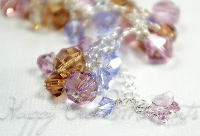
Just for completeness, here's the bracelet on a plain white background. Too bland right?
I really need to stop obsessing over this and just pick one! Gray or brown, gray or brown??


1 comment:
i liked the dark grey one
the cloud one is a bit childish but it matches your brand perfectly.
the lights did wash out the colors a bit, but u could do a white and then a black on etsy for comparison
hope that helps =]
Post a Comment